Modernizing the driver experience for paratransit operations
Ecolane's driver application — the screen paratransit drivers rely on for every pickup, drop-off, and fare across a shift — had aged out of step with the platforms it ran on. We evaluated the workflows drivers live in all day and redesigned the key screens to platform standards: familiar, accessible, and lower-risk to adopt.
This was a commercial engagement delivered by the team behind This Waay. It is presented as relevant experience for public-systems work — not as a government contract reference.
Context
Ecolane provides transportation logistics for passengers with expanded needs — the riders who depend on ADA paratransit service. Its driver application is the daily workhorse of paratransit operations: the screen a driver relies on for every pickup, drop-off, and fare adjustment across a shift.
The existing experience had aged out of step with the platforms it ran on. Because it was not supported as a native iOS experience, transit operators had to purchase dedicated hardware alongside their subscription — an avoidable cost and procurement burden. And its bespoke interface patterns meant every new driver needed custom training.
We were engaged to redesign the key screens of the driver experience around platform standards: a concept strong enough to remove the dedicated-hardware requirement, reduce training burden, and give leadership a concrete reference point for sustained design investment.
We led the evaluation and redesign — identifying the screens that mattered most, diagnosing the friction in each, and delivering a modern, standards-aligned concept the team used to align stakeholders and plan investment.
Methodologies
- Key screen and workflow prioritization
- In-vehicle usage ergonomics review
- Problem and opportunity framing per screen
- Platform standards alignment (iOS / iPadOS)
- Concept prototype development
- Before-and-after design documentation
Deliverables
- Prioritized set of key screens for redesign
- Problem and opportunity analysis for core workflows
- Redesigned trip, passenger, and fare-management experiences
- Modern navigation and information architecture
- Consistent color and status language system
- Concept prototype supporting standard-device distribution
Interface debt had become an operational constraint.
Drivers work in a demanding context: mounted tablets, moving vehicles, tight schedules, and passengers who depend on them. Every extra tap or ambiguous status indicator has a real operational cost — and for riders with expanded needs, reliability is the service.
The evaluation focused on the workflows drivers live in all day, where the friction was clearest:
- Trip and stop management — the main page of a driver's day had navigation and flow issues, with non-standard indicators carrying critical meaning
- Passenger management — helpful context existed, but the visual hierarchy made the next step hard to see
- Fare editing — custom input controls, rather than the standard system keyboard, made routine edits a challenge
Beyond the screens themselves, the platform gap defined the stakes: without a standards-aligned experience, operators could not use devices they already owned.
The task was to modernize decisively, within a right-sized scope — small enough to deliver quickly, complete enough to prove the path.
Not every screen needed a redesign. The ones drivers touch constantly did.
Rather than a wholesale rebuild, we identified the global elements and key workflow screens that define the experience — navigation first, then the trip, passenger, and fare workflows that make up the bulk of a driver's day.
For each area we framed the problem and the opportunity in plain language the whole team could align on:
- Organize the flow so a driver naturally progresses from all stops into detail
- Separate start-and-stop actions from navigation, and make the current trip unmistakable
- Present passenger actions dynamically and state-aware, disclosing options progressively
- Replace bespoke input controls with the standard system keyboard and clear field organization
Grounding every decision in familiar platform patterns served two goals at once: an experience drivers already know how to use, and a system that runs on the devices operators already own.
A driver's whole day, organized around one clear structure.
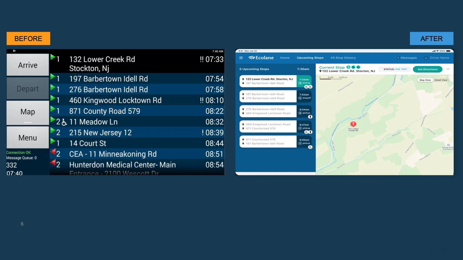
The redesigned experience reorganized the driver's day around a clear, persistent structure:
- An always-visible list of upcoming stops with times, pickup and drop-off counts, and accessibility indicators at a glance
- A prominent current-stop header with trip status and direct access to directions
- A live map view alongside the manifest, replacing the old pattern of hopping between modal views
- Progressively disclosed actions — arrive, message, adjust — where and when drivers need them
- Universal iconography and a consistent color and status language, replacing ambiguous custom symbols
Fare and passenger editing moved to standard components: full-page views, the system keyboard, and clearly labeled fields with persistent navigation — so drivers always know where they are.
A focused engagement changed what the system could do — not just how it looked.
- A modern, standards-aligned experience that removed the dedicated-hardware requirement, letting operators use devices they already own
- Familiar design patterns that reduce the need for bespoke driver training
- A tangible, high-quality reference point that leadership used to plan sustained design investment
For a service carrying riders with expanded needs, the stakes are bigger than convenience: clearer tools for drivers translate directly into more reliable service for the people who depend on them.
Staff-facing tools are part of the service.
ADA paratransit is a mandated public service, and its reliability is measured one pickup at a time. The tools drivers and staff use are part of that service — interface debt in a staff-facing system quietly becomes hardware costs, training programs, and operational risk.
The same pattern holds across public systems: aging staff tools accumulate constraints that show up in budgets and service levels. A right-sized, human-centered modernization — grounded in evidence about the workflows staff actually live in — can remove those constraints without a disruptive replatform.
More engagements that show how we work.
Let's find the signal.
Is an aging staff-facing system constraining your service? Tell us about the program you're trying to improve — we'll propose a right-sized way to begin.
Start a conversation →