Unifying a fragmented multi-portal student journey
After consolidation, students navigated four web portals and two mobile apps to answer basic questions. We mapped the full journey from application through graduation, defined a validated end-state, and delivered a sequenced modernization roadmap that never depended on a risky replatform.
This was a commercial engagement delivered by the team behind This Waay. It is presented as relevant experience for public-systems work — not as a government contract reference.
Context
Portico is an end-to-end student platform bringing attendance, skills tracking, payments, and academic progress together under a single brand. Its capabilities grew through consolidation — which meant students were navigating multiple web portals and mobile apps with overlapping functionality, inconsistent navigation, and different visual languages.
As the organization began delivering a true end-to-end service, the fragmented experience became a strategic risk. Schools needed a reliable channel to reach and activate students; students needed one clear place to understand where they stand and what comes next.
Over eight weeks, we evaluated the student experience across every platform in the suite, modeled the full journey from application through graduation, and designed a validated end-state concept for a single unified experience — paired with tactical guidance for the quarter's roadmap.
We partnered with the cross-functional product team to define how the student journey should flow — from first login to academic completion — delivering both a validated end-state and the near-term design guidance to unify the experience milestone by milestone.
Methodologies
- Cross-platform heuristic evaluation
- Journey and touchpoint mapping
- Information architecture analysis
- Collaborative design artifacts and models
- End-state concept design and prototyping
- Phased roadmap and milestone definition
Deliverables
- Usability findings across first-time experience, skills, and progress visibility
- Student experience touchpoint map spanning the full journey
- Unified navigation and information architecture recommendations
- Validated end-state design with clickable prototype
- Skill-logging redesign with a responsibly scoped AI-assistance concept
- Tactical design guidance for near-term initiatives
Every extra portal was another place to get lost.
A student's journey touched four student-facing web portals and two mobile apps — each with its own login, navigation, and conventions. Core needs were scattered: skills lived in one system, attendance in another, grades and program progress in a third.
The fragmentation created problems on both sides of the service:
- Students could not easily answer "am I on track?" across their program
- Schools lacked a centralized, mobile channel to reliably reach and activate students
- First-time experiences varied from friendly and guided to confusing and administrator-dependent
The organization knew the end state it wanted: one mobile app, one web portal, one cohesive design. What it needed was an opinionated definition of that experience — and a realistic first milestone to build toward.
The task was to turn a portfolio of acquired tools into one coherent journey, without waiting for a multi-year replatform.
We walked the journey the way a new student would.
We conducted a heuristic evaluation across every student-facing platform in the suite, focused on the three themes that mattered most for the coming year: the first-time experience, skill logging and approval, and progress visibility across attendance, grades, and program completion.
The evaluation surfaced sharply different strengths across products — friendly, well-guided onboarding in one app; rich progress data buried in another; multi-step workflows that relied on administrator intervention in a third. We synthesized those findings into artifacts the team could align around:
- A touchpoint map showing when the mobile experience should come into play across application, enrollment, and in-class phases
- An honest comparison of each platform's first-time experience, navigation, and information architecture
- A clear, evidence-based recommendation for which product foundation to build the unified experience on
That recommendation — anchoring on the strongest existing system rather than starting from scratch — became the backbone of the design phase, and the single biggest reducer of delivery risk.
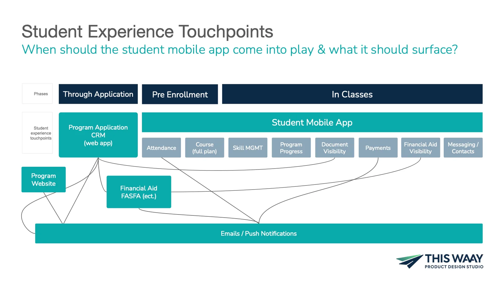
One front door. One navigation. One answer to "how am I doing?"
The validated end-state concept brought the unified experience to life across eight areas of investment — refreshed identity, a dynamic landing experience, scalable navigation, skill management, program progress visibility, unified messaging, engagement, and a responsibly scoped AI accelerator. Key design decisions shaped the concept:
- A dynamic landing page that surfaces the right information for where each student is in their journey — before enrollment, in class, or approaching completion
- Navigation that elevates skills to a first-class area while nesting situational content where students expect it
- A redesigned skill-logging flow aligned to familiar stepped patterns, with consolidated steps and smart defaults for complex scenarios
- A single program-progress overview — courses, hours, and skills in one glanceable view that students can drill into
- Centralized messaging so every update reaches students in one place instead of two levels deep
The full concept was delivered as a clickable prototype in the refreshed brand, giving the team a tangible target to align the organization behind and build toward.
A sequenced path from six fragmented surfaces toward one experience.
The engagement's outputs were structured to be actionable at three horizons:
- Now — tactical design guidance to unify navigation, onboarding, and identity within the quarter's roadmap
- Next — a defined first milestone: one rebranded app integrating skills, attendance, and key academic data
- End-state — a validated, opinionated destination the whole organization could align behind
Because the vision anchored on the strongest existing system, progress never depended on a risky rebuild — each milestone delivered value to students on its own.
The skill-logging work also surfaced a clear opportunity for responsible AI assistance. How we prepared that workflow for intelligence is covered in the companion case study: structure before scale.
Fragmented portals are the everyday reality of public services.
Residents routinely navigate separate systems for related needs — different logins, different conventions, different answers. Consolidation initiatives promise "one front door," but without a defined end-state, each team unifies toward its own center of gravity and the merger reads as more complexity, not less.
The pattern demonstrated here is the safe path: an honest evaluation of what each system does well, an opinionated and validated end-state, and sequenced milestones that each deliver value — modernization without betting the program on a multi-year replatform.
More engagements that show how we work.
Let's find the signal.
Consolidating systems or portals? Tell us about the journey you want residents or staff to have — we'll help you define it and sequence the path.
Start a conversation →